Elowen
Project Packaging + Branding
Role Lead Designer
Tools Adobe Illustrator, InDesign, Photoshop
Agency Freelance
Elowen is a sustainable beauty brand inspired by its Cornish name, meaning "elm tree." The brand blends quiet luxury with earth-first values, offering clean, vegan, cruelty-free formulas housed in fully plastic-free packaging. This exploration aimed to craft a visual identity and packaging system that reflects purity, resilience, and the natural elegance of the elm.
How do you communicate that luxury and sustainability can coexist? Elowen needed a brand that felt both refined and rooted in nature, creating an elevated, thoughtful brand experience that would resonate with conscious consumers without sacrificing sophistication.
The Challenge

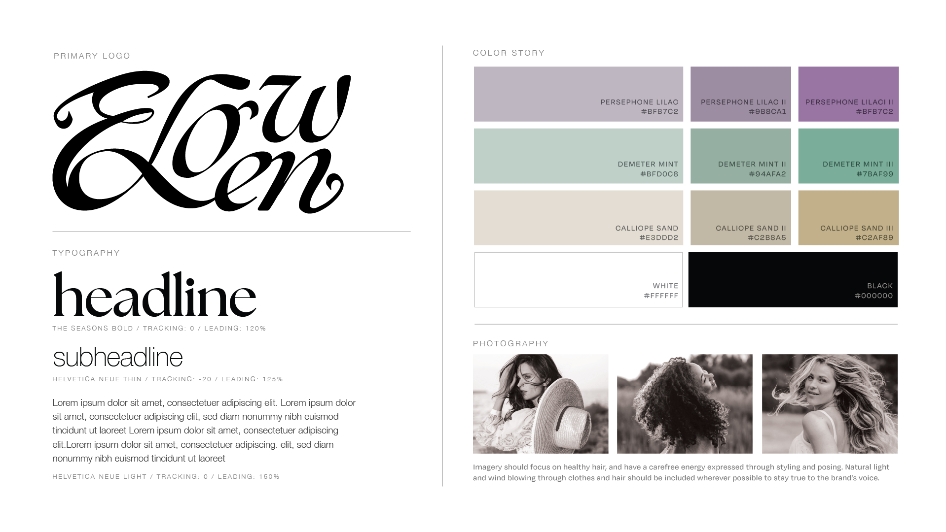
At the heart of the identity is a custom logotype inspired by the curves of leaves, the interwoven growth of plants, and the graceful branching patterns of elm trees. The logo functions as both a typographic mark and a visual metaphor for natural resilience and interconnectedness. The visual system pairs this with natural tones, and minimal compositions that convey calm, sophistication, and environmental mindfulness.
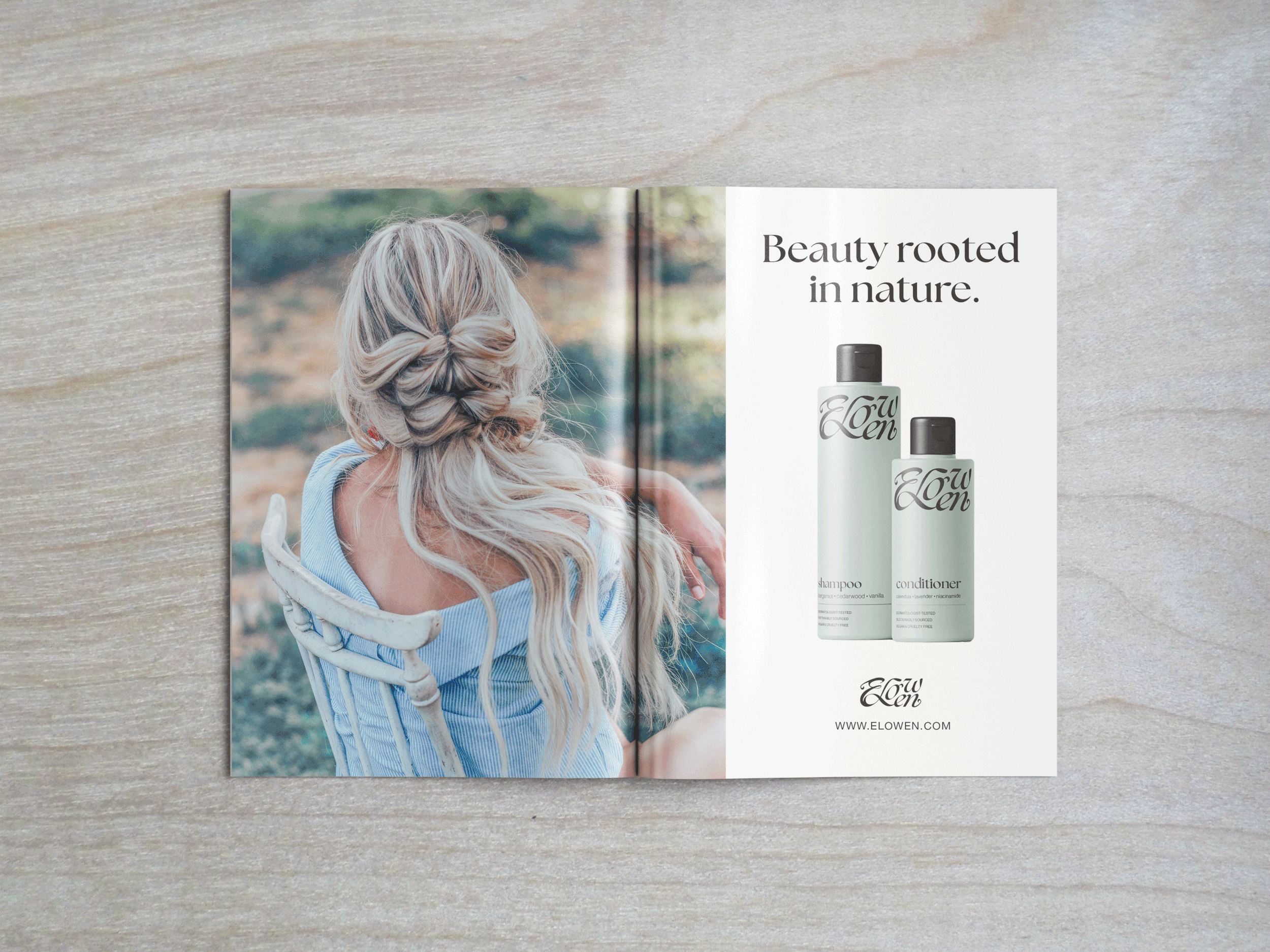
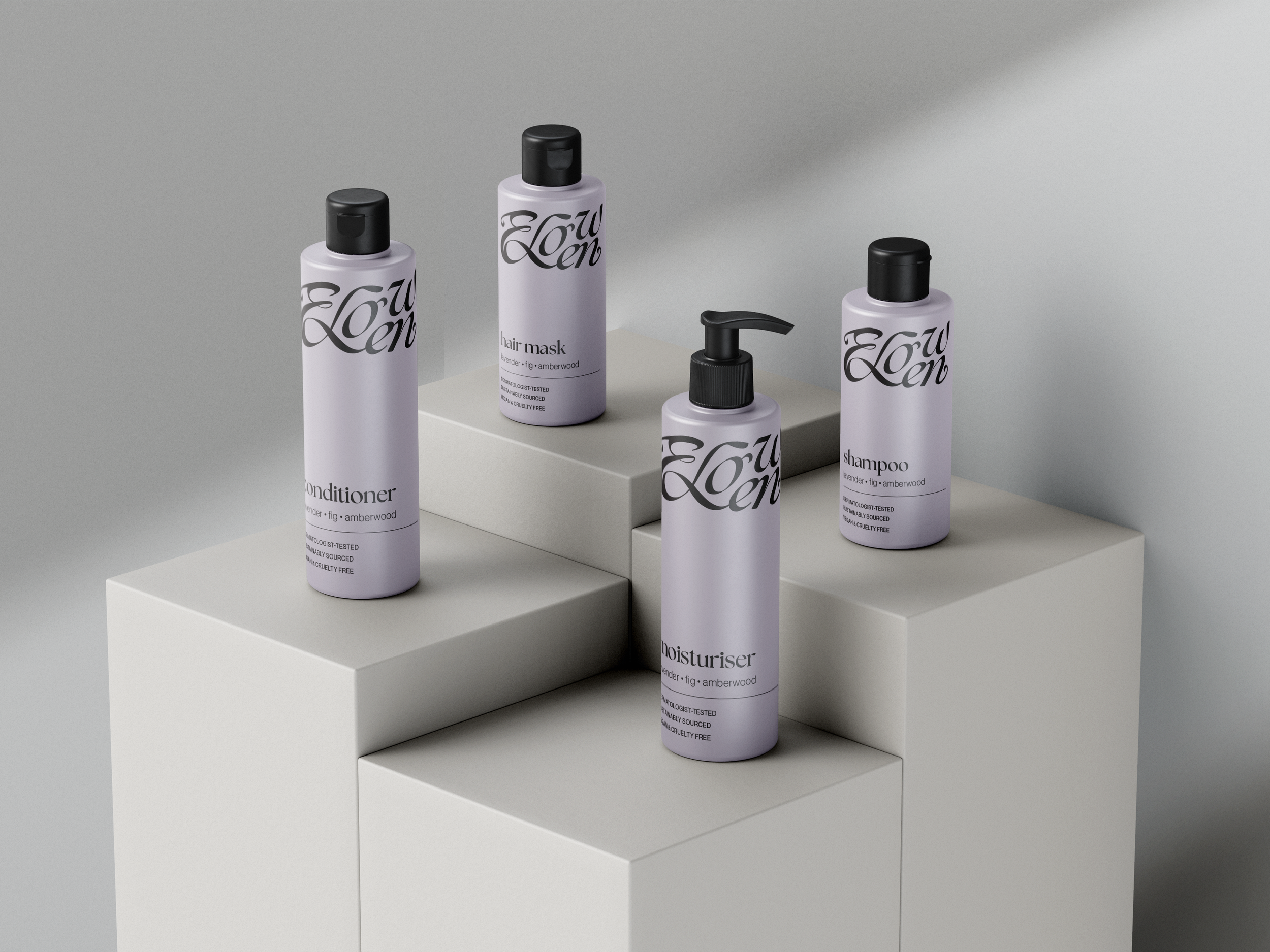
I developed a modular design system that could scale across packaging, digital applications, and promotional materials. Each product (from bottles to boxes) adheres to a consistent hierarchy and visual language, while allowing subtle variations to highlight different formulations or lines. Careful typographic choices and compositional strategies ensure clarity and sophistication, while the organic shapes and textures imbue warmth and humanity.
The Approach


The Elowen exploration resulted in a cohesive, scalable identity that embodies the harmony of nature and beauty, successfully communicating luxury and environmental responsibility as complementary values.
Impact & Deliverables:
Designed a custom logotype inspired by leaf curves, interwoven plant growth, and the structural elegance of elm trees
Created a modular packaging and visual system adaptable across product lines and marketing touchpoints
Built a refined typographic hierarchy that balances clarity, sophistication, and approachability
Produced a brand identity that feels luxurious, grounded in nature, and fully aligned with sustainable principles
